Creating a harmonious home goes far beyond choosing stylish furniture or artful décor. One of the most transformative—and often overlooked—elements is color. The hues, tones, and palettes you select can instantly change the mood of a room, boost your well-being, and influence the way everyone feels in your space. Welcome to the inspiring world of color psychology in home design, where warm, cool, and balanced palettes can shape your daily life.
Let’s explore how color psychology works, which mood-boosting palettes designers love, and actionable tips to energize or calm your home.
What Is Color Psychology in Home Design?
Color psychology is the study of how colors affect mood, behavior, and emotional well-being. In home design, it’s a powerful tool for creating spaces that support your lifestyle and reflect your personality. The goal isn’t just to make rooms look beautiful—it’s to make them feel right for you.
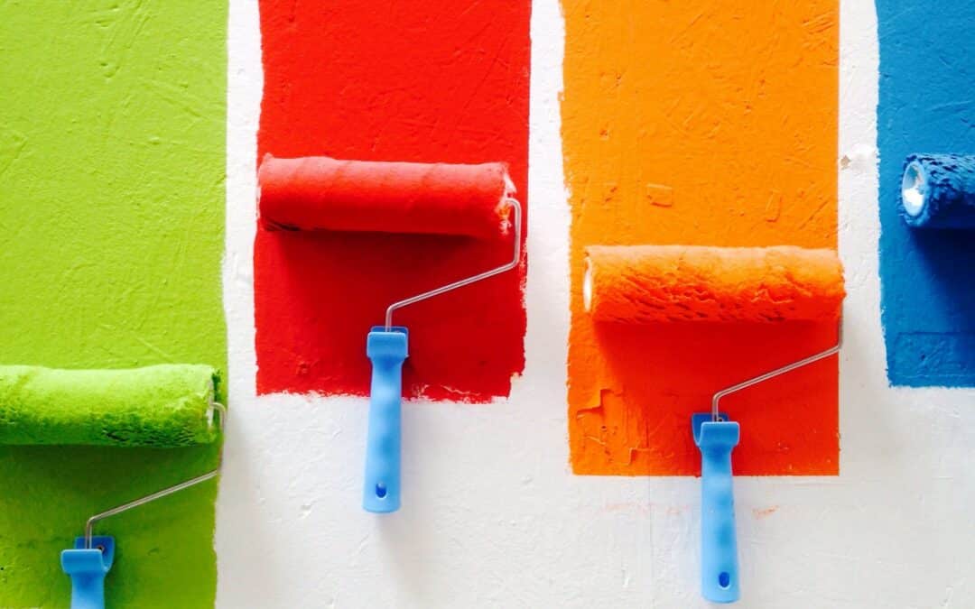
Each color has a specific psychological impact. Warm hues like red and yellow can energize a room and stimulate conversation, while cool tones such as blue and green bring a calming, restorative vibe. Understanding these effects helps you select palettes that suit each space’s function and the feelings you want to evoke.
Why Colors Matter: The Emotional Impact
Your home is not just shelter—it’s your sanctuary, creative studio, and social hub. The right palette can:
- Evoke specific emotions (relaxation, excitement, focus)
- Help reduce stress
- Support mental clarity and productivity
- Enhance comfort and warmth
That’s why top designers start every project by asking: How do you want this room to feel?
Key Colors and Their Mood-Boosting Powers
Serene Blues and Greens: Calm and Rejuvenate
- Blue: Symbolizes tranquility, trust, and stability. Perfect for bedrooms and bathrooms when you want relaxation and better sleep. Lighter blues open up small spaces, while navy adds sophistication to social areas.
- Green: Associated with renewal, nature, and balance. Green tones in living rooms and kitchens promote a sense of harmony, creativity, and calm. Mint, sage, and emerald green are particularly effective for connecting your home to nature and relieving stress.
Warm Yellows and Oranges: Energize and Inspire
- Yellow: Known for elevating mood and stimulating positivity. Soft butter yellows feel cozy in dining areas or kitchens, while brighter shades create lively, sociable energy for gathering spaces.
- Orange: Combines the optimism of yellow with the excitement of red. Peach and muted terracotta are inviting and great for family rooms or studios. Use bolder oranges as accent colors to boost energy in creative zones.
Passionate Reds and Pinks: Invigorate and Express
- Red: Sparks energy, passion, and even appetite. A little goes a long way—try a red accent wall, throw pillows, or statement furniture in a dining room or gym for instant vitality.
- Pink: Offers both comfort and joy. Soft blush and pastel pinks create nurturing, peaceful vibes in bedrooms or nurseries. Vibrant pinks can be playful in social or lounge zones.
Tranquil Purples: Soothe and Inspire Creativity
- Lavender and lilac: Known for their stress-relieving properties, purples quietly balance the stimulation of red with blue’s calm. Ideal for bedrooms, meditation spaces, or cozy reading corners.
Neutral Foundations: Timeless Comfort and Sophistication
- White: Expands space, adds calm, and gives clarity—making it perfect for minimal or modern homes. The key is to bring softer textures or warm accents to prevent a sterile feeling.
- Gray: Conveys sophistication and serenity. Warmer grays and “greiges” (gray-beige) are especially popular for open-plan living or transitional spaces, keeping them fresh but never cold.
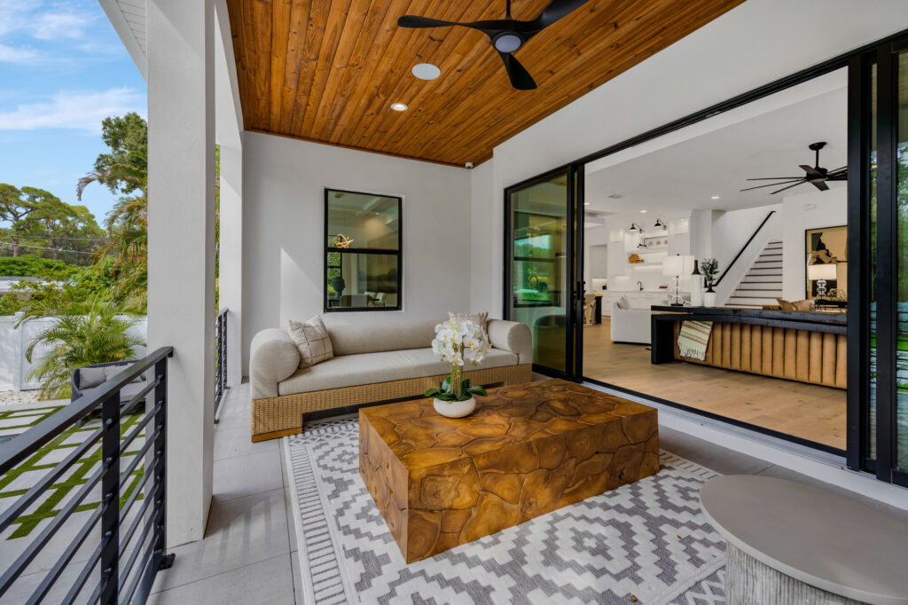
- Beige, taupe, and ivory: Create a soft, inviting backdrop that works with any accent. Perfect for layering in living, dining, or sleeping areas.
- Brown and earthy tones: Think burnt umber, terra-cotta, or cocoa for adding warmth and a sense of stability—excellent for grounding larger rooms or creating a cozy nook.
Designer-Approved Mood-Boosting Palettes
1. Calming Coastal Neutrals
- Palette: Pale blue, soft gray, sand, crisp white
Perfect for: Bedrooms, bathrooms, minimalist living rooms
Effect: Relaxation, mental clarity, comfort.
2. Uplifting Citrus & Cream
- Palette: Sunflower yellow, creamy white, soft beige, mint
Perfect for: Kitchens, dining areas, home offices
Effect: Joy, connection, focus.
3. Modern Earth Tones
- Palette: Sienna, copper, olive, ochre, ivory
Perfect for: Open-concept living, entryways, studios
Effect: Natural warmth, grounded energy, balance.
4. Sophisticated Jewel Tones
- Palette: Navy blue, emerald green, deep plum, ruby red, gold accents
Perfect for: Dining rooms, reading corners, lounges
Effect: Creativity, luxury, inspiration.
5. Playful Pastels
- Palette: Blush pink, powder blue, soft lilac, pale sage
Perfect for: Kids’ rooms, nurseries, guest rooms
Effect: Optimism, comfort, subtle energy.
Smart Tips for Using Mood-Boosting Palettes
- Match color to room purpose: Want to relax? Go for cool tones. Need more energy? Try warm or bold shades.
- Layer and balance: Use neutral wall colors as a foundation, sprinkle in small doses of vibrant accent colors through pillows, rugs, or art.
- Limit bold colors: Rich reds or oranges work wonders in moderation but can overwhelm if overused.
- Play with lighting: Natural sunlight, warm bulbs, or even colored lamps can dramatically shift how your chosen palette feels throughout the day.
- Express yourself: Color psychology is personal! Infuse your palette with shades that make you feel happiest, not just what’s trending.
Latest Trends: What’s Hot in Tier-1 Country Homes
- Warm minimalism—layering taupe, beige, ivory, and soft sage for understated elegance.
- Jewel-toned pops on a neutral background for drama and personality.
- “Forest-inspired” palettes: deep olive, earthy brown, and rich tan for grounded, sophisticated vibes.
- Blush and rose hues for subtle warmth and timeless charm.
- Balanced high-contrast (black and ivory) neutrals with wood or brass accents for modern edge.
Conclusion: Design Your Mood, Design Your Life
Choosing a color palette is more than a design decision—it’s a powerful way to nurture your mood, boost your mental well-being, and create a home that supports every moment. When you understand the impact of color psychology, you can transform any space into a mood-boosting retreat, a productivity haven, or a lively social hub.
Use these science-backed and designer-loved palettes as your guide, but don’t be afraid to get creative. The best palette is the one that makes you feel happy, peaceful, and inspired every day.
Ready to Boost Your Home’s Mood?
Take the first step: Pick a palette that speaks to your heart, and experiment with color in one room today. Small changes can make a big impact. Start now and let the mood-boosting magic begin!